Want to win one of the five exclusive copies? Enter through Waterstone's website here.
It's been a really difficult time for a lot of us due to the sudden changes caused by the coronavirus pandemic - Marmor Paperie certainly took some hits as shops closed up and all our workshops had to be postponed - and I was really unsure how things would play out. But in August, I was approached by Bloomsbury with a job that helped me to find direction again and rekindled my marbling spark from the corona-ashes.
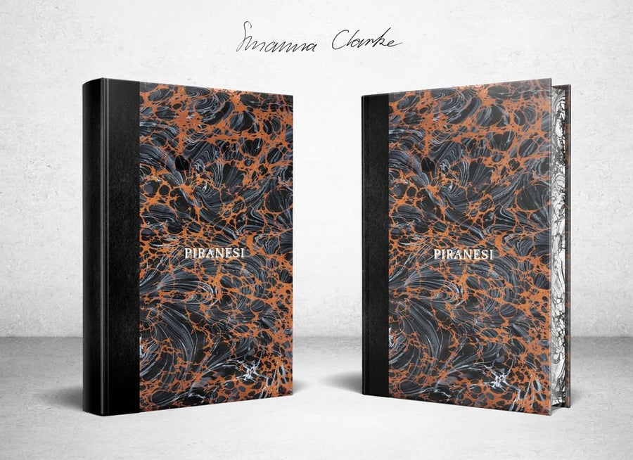
Bloomsbury told me that they were publishing a new novel, called Piranesi, by Susanna Clarke, her first in 15 years - and would I be interested in creating five super-special marbled copies for the launch?
I read Clarke's debut book, 'Jonathan Strange & Mr Norrell' back in 2008 when I was in my first year of university, struggling in a new environment while trying to figure out what I wanted to do with my life. It made a huge impact on me, transporting me to a different, impossibly rich world of magic and intrigue. So it was an absolute dream to even find out she was publishing a new book, let alone be involved in the launch!
We decided on a mega-marbled design, with double-marbled paper on the covers and a complementary paper for the endpapers and on the fore-edges. It's been one of those rare, incredible projects where I was allowed complete artistic license, and I couldn't have asked for a better subject to take inspiration from.
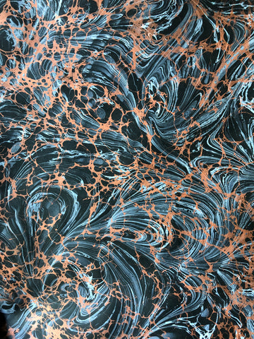
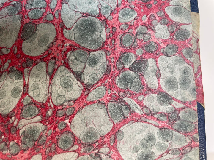
I drew from themes of being lost, order vs chaos, and seafoam (keeping it vague!) when I developed the marbling for the covers. The first layer features frenetic swirls in white, with a Spanish Wave treatment that I wanted to be reminiscent of water. I used a black paper as the base, and I love how the white design almost fades in and out. The second layer is a classic Italian Vein in a shimmering metallic copper - I had to be careful as I didn't want the veining to be so fine that it took attention away from the white swirls - I needed a delicate balance where the two layers interplayed harmoniously.

This is one of the times I'm glad to be both a bookbinder and a marbler, as this was a project involving complex book engineering! Due to manufacturing constraints, I needed to carefully deconstruct copies of the hardback edition of Piranesi, separating the text block from the boards and then rebinding this into a new marble-icious hard cover.
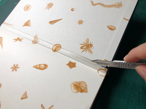
It felt so horrible destroying the beautiful endpapers! I had to work very carefully so as not to damage any parts of the mull or spine lining. Once free, I sandwiched the text block between two wooden blocks I'd had made to match its dimensions perfectly, and then marbled the fore-edges by gently laying them onto my marbling size. I wanted the pattern to continue without breaks so had to use my large tray and roll each edge continuously!

Then came the making of the new covers. I usually make my marbled notebooks and stationery using one big sheet of marbled paper that wraps around the whole book - I like how contemporary and clean this look is for my bright, modern marbling. But for Piranesi, I felt we needed something a little more classic. I opted for a quarter-binding style using an incredible Japanese textured paper on the spine, that feels amazing in your hands and catches the light beautifully.

Bloomsbury had sent me their special Piranesi font so I could stamp the title and Susanna Clarke's name onto the spine with a hot foil press. Despite the initial mock-up having the title on the front, I didn't want it to get lost in or disrupt the flow of the marbling on the cover (it's also traditional to have the title on the spine only for a quarter binding). This was extremely nerve-wracking as I never usually foil onto the spine of my books - I just stamp the boards! It was a nail-biting experience trying to align everything so the text was straight and perfectly centred.

Once the spine and boards were attached, I could cut up the aforementioned marbling on black paper and apply that to cover the rest of the boards. This is where it gets exciting as the book starts to really take shape!

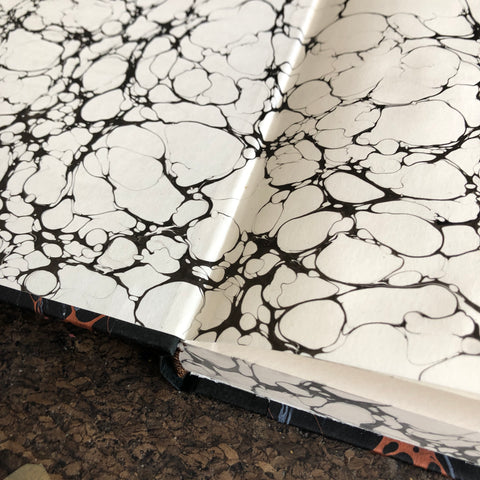
Then came affixing the Italian Vein endpapers (I found a lovely paperstock from GFSmith that matched the colour of the text block really well) - I had to painstakingly slot each endpaper back under the paper that acts as the mull when tipping it on. This tiny bit of paper eventually helps to hold the text block into the cover, so - pretty important!
Then the final and most terrifying part of bookbinding: casing in. This is where everything can go totally wrong and all your hard work up to this point is wasted! I aligned the text block on the covers and applied glue to the back of the endpaper. Then you just close the book cover on top of it and pray everything is still aligned correctly!
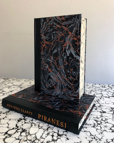
I really love how the final books look - I think the marbling reflects the feel of Piranesi's story and I really hope the lucky winners agree. It will be so hard saying goodbye to these!